Friday, December 19, 2014

Contrast pictures

 Contrast in Texture: edited to show how "fuzzy" the cat is
Contrast in Value: edited to show the eye cataracts
Contrast in Color: cool design, so I edited it to make three different sections of color

Contrast in Scale: not edited

Project 4: Balance and Contrast


Friday, November 21, 2014

Extra Grids

Some extras


Color Grids

This project, Color and Grids, was used to help us learn the different color schemes. We used warm colors, cool colors, monochrome, and complementary. Each person individually took their pictures and used Lightroom to edit them. After the were edited, I made grids for each different color scheme. The final step was to take a photo and change the mood of it. For mine, I took a photo of a flower and played with the blues and reds in the picture to make it look cold.

Warm Colors
Cool Colors
Complements
Monochrome


Mood


Monday, November 17, 2014

Warm Photo


The photographer, Corey Arnold, took a photo of all the lights on in the Acropolis. He then over exposed the lights, causing an explosion-like look. The photo is using warm colors, which helps the glowing look of the 'fire'. 


Color Wheel


Wednesday, October 29, 2014

Project 2: Framing and Composition

      For this project, I took photos representing eight categories: Rule of Thirds, Frame Within a Frame, Close Up, Bird's Eye, Bug's Eye, Leading Lines, Diagonals, and Fill the Frame. I shot my photos with my iPhone 4S, and, with the exception of a couple, I took them all in downtown Portland. I posted the photos below because I thought they had a cool look to them, and as I was editing them I realized that there were some really cool things I could do with them. 
+In my Rule of Thirds photo, I mainly just adjusted the exposure, contrast, saturation, etc. I wanted to make the building match the sky, so I fiddled around with the color until it looked right.
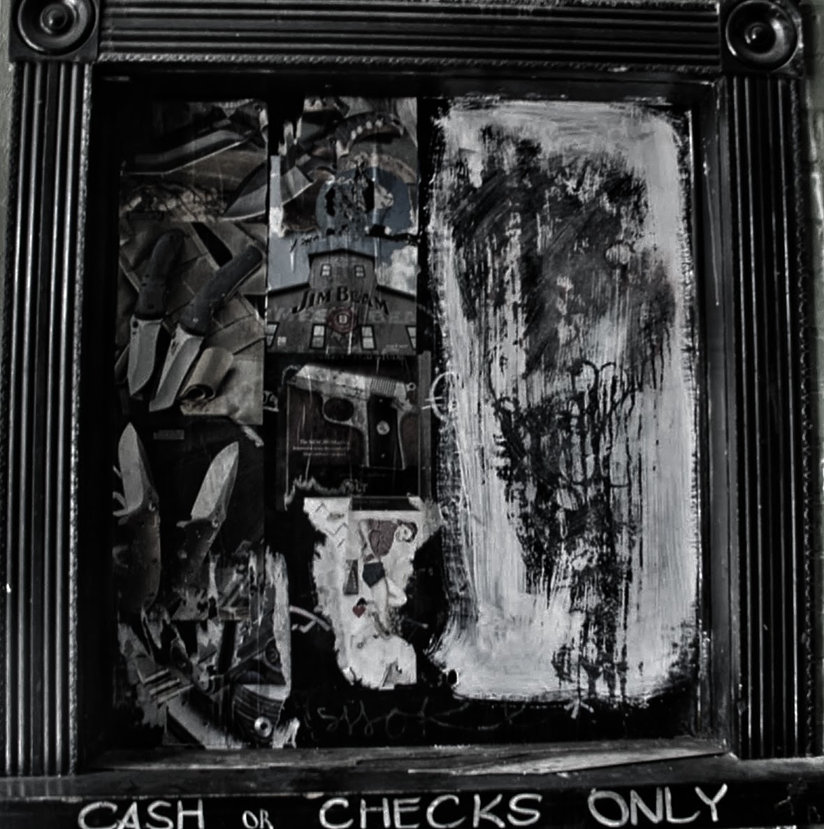
+In my Frame Within a Frame photo, I wanted to make it look like it wasn't in reality. I began messing with the details and clarity of the photo, until it looked almost animated.
+In my Close Up photo, the original had been washed out because of the light bulb. I wanted to be able to see the actual bulb and what was around it, so I used the lighting controls to eliminate the washed out parts of the photo. 
+In my bird's eye photo, I wanted to make sure all the color in the leaves showed. The colors in the original photos were very vibrant, but it was hard to focus on the the leaves itself. Therefore, I increased the clarity, and limited the vibrant colors to a few leaves. This way, it's easier to focus on the leaves and take in the photo as a whole. 
+In my Bug's Eye photo,  I wanted to make everything super vibrant. I increased the color in everything, starting with the brightness and ending with the general color of the blue, green, and red. Overall I wanted the photo to have a very pure, clean cut look.
+In my Leading Lines photo, I wanted to bring the focus to where the lines were leading, which seemed to be the sky. I increased the clarity, and I increased the color brightness in the sky, so the attention focus is mainly on that.
+In my Diagonals photo, I wanted the lines to really pop out. In all the green, I wanted the yellow and white lines of the field to really stand out and bring your eyes in. I increased the clarity of the overall picture, and the brightness and contrast of the field in general.
+In my Fill the Frame photo, I wanted the attention to only be on the beans. I increased the blacks in the photo, which washed out anything that wasn't part of the bean. I was really happy with the overall end product of this photo, because I thought that the individual structure and clarity of the beans looked really cool.


Rule of Thirds
  
Frame Within a Frame
 Close Up
Bird's Eye
Bug's Eye
Leading Lines
 Diagonals
Fill the Frame

Friday, September 26, 2014


  I took this photo because I really love abandoned, decrepit looking places. The outside looks old and the paint is flaking off, which I thought looked really cool.
I edited the picture of the theatre to look a little scarier in a sense. I love horror themed things, so I tried to make it look more dramatic and worn down.

  I took this photo in the inside of the opening to the theatre to show what it was like when you went further: completely worn down and unsanitary
All the photos of the theatre I edited mostly the same. I wanted sort of an apocalyptic look to it, just because I really like the intensity of the darker effects.

  I really love graffiti work, and although this isn't the normal stereotypical graffiti you see on the sides of buildings, I really liked how things were glued and stacked on top each other to make the building look messier and more abandoned.
I made this photo dark, almost black and white but I kept some very faint color in there to try to make it look more realistic.


I really liked the lights and how they looked with the sky and the buildings in the background.
I adjusted the focus so it was mainly on the lights, but not so much that you couldn't make out the background.


 I saw this sign on the street and I took a photo because I never stop to think about what these signs really say. I added a filter that made it look lighter and happier in a sense.


Friday, September 12, 2014

This summer was filled with fun memories and hard work. Every day I played soccer, and I worked extremely hard to be able to play on a varsity team at Lincoln High School. That, by far, was my biggest accomplishment this summer. Other than playing, I spent time with my friends and went to my neighborhood pool. My best friend lives an hour away from me, so I get to see her only about once or twice a year. Every year we go to a place called Halfway, Oregon, a six hour drive to the East of Portland. This is my absolute favorite place, as the weather is as nice as the people and the views are even better.