Wednesday, January 14, 2015
Project 5: Basic Photoshop and Camera controls
I used four photos for this project: Shallow depth of field, Deep depth of field, Freeze Motion, and Motion Blur. For shallow depth of field I focused only on one thing in front of the other, which was my friends face. This made the background blurry. For deep depth of field, I took a photo of a landscape, and a bottle in front. I made everything focused, so it would meet the criteria of a deep depth of field photo. For Freeze motion, I took a photo of a small waterfall and made the water look frozen. For Motion Blur I took a photo of my friend dancing, and made sure she was blurry.

Friday, December 19, 2014
Contrast pictures

Contrast in Texture: edited to show how "fuzzy" the cat is

Contrast in Value: edited to show the eye cataracts

Contrast in Color: cool design, so I edited it to make three different sections of color

Contrast in Scale: not edited


Friday, November 21, 2014


Color Grids
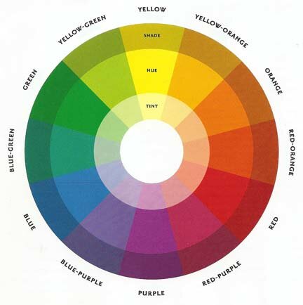
This project, Color and Grids, was used to help us learn the different color schemes. We used warm colors, cool colors, monochrome, and complementary. Each person individually took their pictures and used Lightroom to edit them. After the were edited, I made grids for each different color scheme. The final step was to take a photo and change the mood of it. For mine, I took a photo of a flower and played with the blues and reds in the picture to make it look cold.


Warm Colors
Cool Colors
Complements
Monochrome
Mood
Monday, November 17, 2014
Warm Photo
The photographer, Corey Arnold, took a photo of all the lights on in the Acropolis. He then over exposed the lights, causing an explosion-like look. The photo is using warm colors, which helps the glowing look of the 'fire'.

Subscribe to:
Posts (Atom)