Wednesday, May 20, 2015

Monday, May 18, 2015


Monday, May 4, 2015


Commercial Portrait Photographers

I think this is a very commercial magazine cover that works because the woman in the middle is very pretty and draws the attention to the dress/hair/makeup/accessories that come with having a wedding. It's all very architectural with the colors of the buildings matching the text, so it looks very pleasing to the eye.

I like this magazine cover because all the words and colors are the same, and the green at the bottom looks really good as well. Also, an action shot makes a really good cover because it's appealing to the eye and looks really cool, so this whole thing works well.
Fine Arts Photographers

Jason Sinn Photography
I like this photo because I can't really tell what it is, and so that interests me. It looks like an African American man painted white, which is a really interesting and captivating thing to think about. The contrast between the black and white, especially the cracks in the white, is very clear to see.

Dmitry Ageev
I really like this portrait because it's completely of the girl, and nothing else. The earth toned background matches the tones in her skin and hair, and it all gives a very natural and innocent look.
Wednesday, April 8, 2015
Project 8: Surrealism and Photomontage

I covered the trees with broccoli, and covered the ground with huge leaves. I also covered the sky with huge flowers and made the sky have a brick look to it by covering it with a photo of a brick wall that I took.

I wanted to experiment with the sizes of different things: I made the smallest real life object the largest, and the largest real life thing the smallest. I also just for fun added a couple pictures of maya dancing on a fire hydrant. For extra effect I added a texture into the background.

I wanted to make this picture just because I thought it was really funny, and because I had once done a photo project just like this with Maya and Olimpia. It was very similar, just portraits of their heads, but this time I wanted to create an unrealistic look to it.
Monday, March 30, 2015
Surreal Photos
Surrealism:
a 20th-century avant-garde movement in art and literature that sought to release the creative potential of the unconscious mind, for example by the irrational juxtaposition of images.

Salvador Dali: Ship with Butterfly Sails
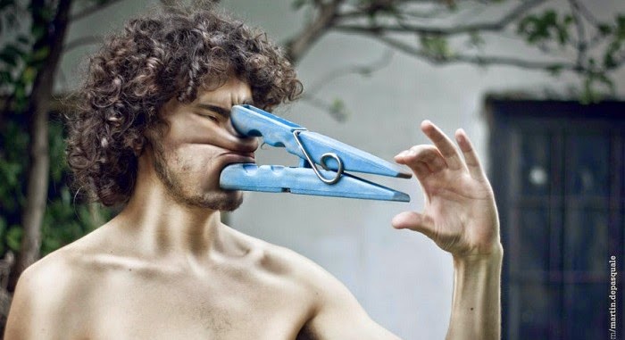
Martin De Pasquale

Sebastian Erikkson
Friday, March 6, 2015
Project 7 EXTRAS

I took this photo of Maya for a couple projects ago, and I just really like how her face is completely even and facing forward. It's a simple picture of her face, therefore I think it would make a good daguerrotype.

I created this daguerrotype by blurring it, tinting the color, and adding grunge textures to make it look older. I finished it off by adding a grungy border.

I took this photo a while ago, and I used it for an extra because I thought it would be a fun photo to play around with a lot.
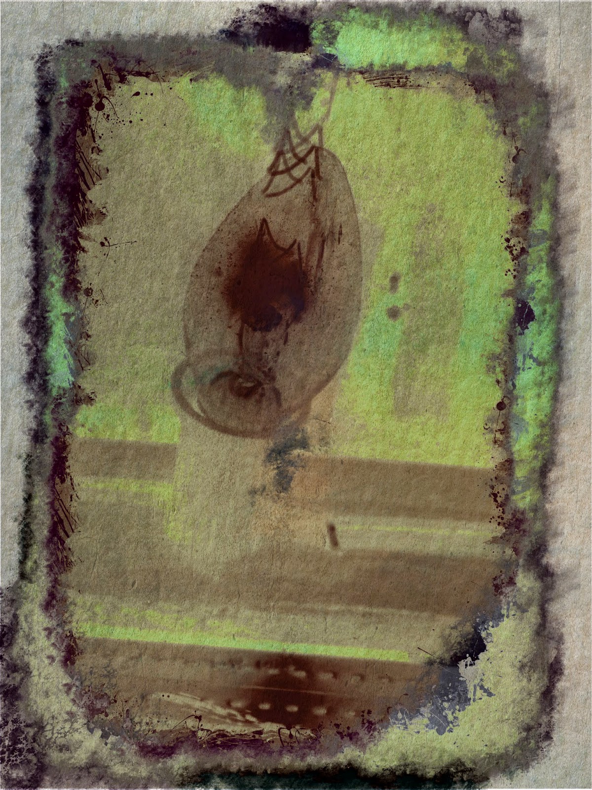
This is a gum bichromate photo, and I just wanted to see how it would turn out with a whole bunch of edits to it.
Project 7: Alternative Processes through Digital Means

I took this photo on a walk a while back, I thought the leading lines techniques were really cool, and the leaves on the ground made it look like a very typical Portland day.

Cyanotype: a photographic blueprint.
Using the photo I took on the walk, I created a cyanotype. I created new layers in photoshop, and created the borders and new colors, so the photo would look completely different and older. Then I added a watercolor texture to add a different and new look.

I took this photo of caper when I was at home, because the lighting wasn't the best and he kind of looked blurry, which I thought would be good for a project like this.

I created this photo by blurring it, tinting the color, and adding grunge textures to make it look older. I finished it off by adding a border to make it look like it's on a silver plate.

I took this photo the other day when I was taking my dog out for a walk, and thought it would look cool for this project because the light was hitting my phone in a weird way, and it made it look kind of grungy and bad quality. Therefore it was kind of a bonus and a lead because I didn't have to edit it all that much, other than adding color.

Friday, February 20, 2015
Project 6: Multiple Image Techniques


panorama: I originally took this panorama of a double rainbow, but the top rainbow was very hard to see. I wanted the bottom rainbow to look more normal, and brighter, so I adjusted the overall brightness, and sharpened just the rainbow. Then I went and sharpened the top rainbow a lot, so it would pop a lot more. Because of this, the rainbow became very pixilated. I wasn't sure if I liked it, but when I zoomed out it had kind of a cool look to it, and it looked like nerds, so I kept it. I thought it was unique.

HDR: For my HDR photo I took a picture of the LHS field on a really sunny day. The sun was so bright that you couldn't see the buildings or the trees, and barely any of the bleachers. I used two pictures: I overexposed one of them, and underexposed the other. It's still really hard to see where the sun is, and I couldn't really figure out how to make that all go away. But I made the colors match, and it still looks sunny, so I'm happy with the final product.
Tuesday, January 27, 2015

Wednesday, January 14, 2015
Project 5: Basic Photoshop and Camera controls
I used four photos for this project: Shallow depth of field, Deep depth of field, Freeze Motion, and Motion Blur. For shallow depth of field I focused only on one thing in front of the other, which was my friends face. This made the background blurry. For deep depth of field, I took a photo of a landscape, and a bottle in front. I made everything focused, so it would meet the criteria of a deep depth of field photo. For Freeze motion, I took a photo of a small waterfall and made the water look frozen. For Motion Blur I took a photo of my friend dancing, and made sure she was blurry.
Friday, December 19, 2014
Contrast pictures

Contrast in Texture: edited to show how "fuzzy" the cat is

Contrast in Value: edited to show the eye cataracts

Contrast in Color: cool design, so I edited it to make three different sections of color

Contrast in Scale: not edited


Friday, November 21, 2014


Color Grids
This project, Color and Grids, was used to help us learn the different color schemes. We used warm colors, cool colors, monochrome, and complementary. Each person individually took their pictures and used Lightroom to edit them. After the were edited, I made grids for each different color scheme. The final step was to take a photo and change the mood of it. For mine, I took a photo of a flower and played with the blues and reds in the picture to make it look cold.


Warm Colors
Cool Colors
Complements
Monochrome
Mood
Monday, November 17, 2014
Warm Photo
The photographer, Corey Arnold, took a photo of all the lights on in the Acropolis. He then over exposed the lights, causing an explosion-like look. The photo is using warm colors, which helps the glowing look of the 'fire'.

Subscribe to:
Posts (Atom)